Showing posts with label visual literacy. Show all posts

Monday, 29 May 2017

Digital Bytes - May 29th 2017


Podcast - WOW in the World

Hot off the press is a podcast by NPR is aiming to be “a new way for families to connect, look up and discover the wonders in the world around them.” Scientifically based, WOW in the World is sure to be a winner for your classroom and beyond.

Data Basic.io

Data Basic is a tool for analysing text and data quickly to look for patterns. Paste in some text, or upload a file to find out the frequency of words, how similar and different two files are, connections and interrelationships in your data. Check out the samples and videos to show you how the tool can be used.


Film Resources - Michael Hernandez

At the recent ReThinking Literacy conference, Michael Hernandez shared this Padlet of Digital Storytelling resources. There is a wealth of information contained, including how film can inspire empathy, podcasts in the classroom, and the art of the video interview. You might want to also connect with Michael on Twitter for more cinematic exploration.

Tuesday, 29 November 2016

Learning How to Focus

Take a look at the photo below. What does it tell you? What do you notice?


It tells me that with close to 60 tabs open, this student was so distracted by the extension that he/she wasted a significant amount of time being off task. The worrying thing is that if this student continues these patterns of behaviour, he/she will find it increasingly hard to focus on learning. Let's face it - learning is our business!

But how much direct teaching goes into helping students learn how to focus? I'm willing to wager not enough. We need to be fair to our students: we can't expect them to pick it up through osmosis. As teachers, part of our role is to teach into how to focus, not merely that one should focus.

Telling students to delete distracting elements such as non-educational chrome extensions is not enough; students need to understand the reasons behind the request - why is it unsuitable for learning?

After all, they're not doing this maliciously - they have a genuine curiosity and love making their devices feel like their own. The trouble is, many of their choices have a negative impact on their ability to stay on track and focused.

Helping students to identify what helps their learning and what hinders their learning is a great place to start.

Chrome Extensions
Recently, we had a number of students install a Chrome Extension called Tabby Cat. It's a cute, harmless-looking extension that shows a different cat every time you open a new tab. You can interact with it, and sometimes you will get little gifts to play with. Sounds ok, right?

I asked the class to tell me what they liked about this Tabby Cat. Predictably, the responses were as follows:
"It's cute!"
"It's fun because you get toys to play with if you keep opening new tabs."
"Every new tab is different."
"I want to see what is going to happen next and if I will get any gifts"

Helping students understand that each new picture of a cat is essentially rewarding distracting behaviour, can help them make better choices.

One recommendation is to replace Tabby Cat with the Chrome Extension Momentum, which gives one new picture a day, together with the question: What is your main focus for today? This personal reminder prompts students that they have a task to complete, with a beautiful photo that doesn't change every tab. 


Vision and Movement
"Vision trumps all other senses,"  according to John Medina, author of Brain Rules. Approximately half of the brain's resources are dedicated to processing visuals. Our brains are attuned to noticing colour and movement, so moving backgrounds, animated gifs and scrolling advertisements draw our attention.


In a G3 class recently, we did an audit of our visual noise. Common things we saw were:
  • Animated snow falling on Gmail backgrounds (or similar)
  • Desktop backgrounds where the picture changes every 5 seconds
  • Highly pixelated images used as desktop backgrounds
In pairs, students helped each other make good decisions to remove distracting movement - that was the easy part. The hard part was making good decisions about their desktop backgrounds. Saying goodbye to their favourite sports star or cartoon character was more of a challenge for some.

We discussed quality resolution of images being more pleasing to the eye. We also introduced the idea of colour association. Green is a calming colour (think, Green Rooms backstage in theatres) and blue can help with productivity. Encouraging students to choose a green/blue-based image that is high quality helped them see they still had some choice and the option of personalisation, but not at the expense of their focus.

Number of Desktops
Students using school laptops that don't go home, really have no need for multiple desktops. Deleting extra desktops will help to remove the temptation to swipe between apps.


Reader View (Safari) or Readability (Chrome Extension) 
When looking at websites, particularly those which have articles, using Reader View in Safari or  the Chrome Extension Readability can help strip away those annoying advertisements and other extraneous and distracting material, allowing us to focus primarily on the text and images in the article. Check out the tutorial below:

Effective Digital Reading using Safari Reader View from UWC South East Asia on Vimeo.

Tidying your "Room" 
When in a rush, it's easy to leave your desktop background as a cluttered disaster, always thinking, "I'll clean it up later." Many of our student's desktops look like this (not unlike my teenage bedroom):


A secondary-click (right-click, or 2-finger tap) > Clean up by > Kind, helps organise files into groups of the same type. See below:


Once organised by kind, it's easy to trash all the screenshots and/or arrange files into folders.

We recommend moving files/folders to Google Drive or Documents on a Mac (depending on file type) rather than keep things on the desktop, so as to make startup as smooth as possible. Aesthetically, it's also more pleasing!


These suggestions are aimed at helping empower our younger students to make better choices by being well informed about distracting elements on their laptop. If you are interested in specific apps and Chrome Extensions to take managing distractions one step further (blocking specific sites etc), you may wish to check out our recent Parenting in the Digital Age resources.

Do you have any other great tips for managing distractions in primary? We welcome your ideas!

Tuesday, 15 November 2016

Visual Note-taking: High School Applications


I read the last post about visual note-taking...but I'm not sure it would work in a high school classroom...

This post is for you.

Thank you to one of our Tech Mentor's: Georgina, for walking us through her first trials of sketchnotes:


If you are interested in support with these techniques, contact a DLC for a subject-specific workshop.

Saturday, 12 November 2016

#teacherbookclub roundup for November

Has Twitter become a virtual staff room for teachers everywhere?

#teacherbookclub is a monthly online discussion of books relevant to today's educator.  Past guest authors have been Bill and Ochan Powell,  George Couros, Angela Maiers, and John Spencer.

This weekend #teacherbookclub discussed a multi-touch free book focused on visual note taking.  This book was co-authored by a group of Apple Distinguished Educators (including Dover's Nicki Hambleton). You can still download Sketchnoting for Teaching and Learning by


What does a 'Twitter' book club discussion look like?

In the week's leading up to the chat, the questions are shared in advanced and participants have time to consider resources and answers they'd like to share.  This month's questions are here:

#teacherbookclub - Created with Haiku Deck, presentation software that inspires;


What can I expect to learn from lurking or participating?

Here is the recap of tweets shared in this month's hour of #teacherbookclub.
If you'd like to join next month's online forum, please see a DLC to learn more.
For a guide to hosting your own Twitter chat, click here.


Monday, 7 November 2016

Digital Bytes 7th November 2016


The iPad Conference over the weekend was an action-packed 2 days of fun and learning. We have decided to make this edition of the Digital Bytes have an iPad focus. Enjoy!

IMG_9595.JPG
Visual Thinking

Two great apps we love for visual thinking are Adobe Capture & Adobe Illustrator Draw (both free). Create illustrations out of your photos, or draw over the top of a picture to create beautiful images, or use a combination of text and images to create visual notes. Remember to sign up for a class account and have your students log in with that as they are under 13.
Nicki Hambleton’s Precon, Learning & Thinking out Loud, had loads of resources for visual note-taking & visual thinking routines we urge you to explore!
Fantastic Maths Apps

Make sure you have a look at some of the great math apps we have available on our iPads. Have a look at Number pieces which is a base ten blocks app, Number line, and Fractions. The amazing thing is that they are available online as well.
Touchcast app

Touchcast is a fantastic green screen app with so many possibilities.

One of the coolest features is that you can put a YouTube video in the background of your video. You can also annotate videos and webpages.  

Monday, 23 November 2015

Digital Bytes - 16 November 2015


How to Provide kids Screen Time that Supports Learning
Kids are now spending more time on devices like iPads than watching television. “Children not only need to learn how to decode the letters and words they read, but also to gain an understanding of what goes into creating information and stories of all kinds.” This article talks about the three C’s: Content, Context and Child and the importance of balance.
9 Videos on News Literacy
Our students are increasingly getting their information from videos. How are we supporting them in this form of literacy?

This article examines what you as a teacher can do to help your students be more critical of the videos they watch.

The videos range in topics from how to choose your news to why the news isn’t really the news.
Classroom Eye Candy: A Flexible Seating Paradise
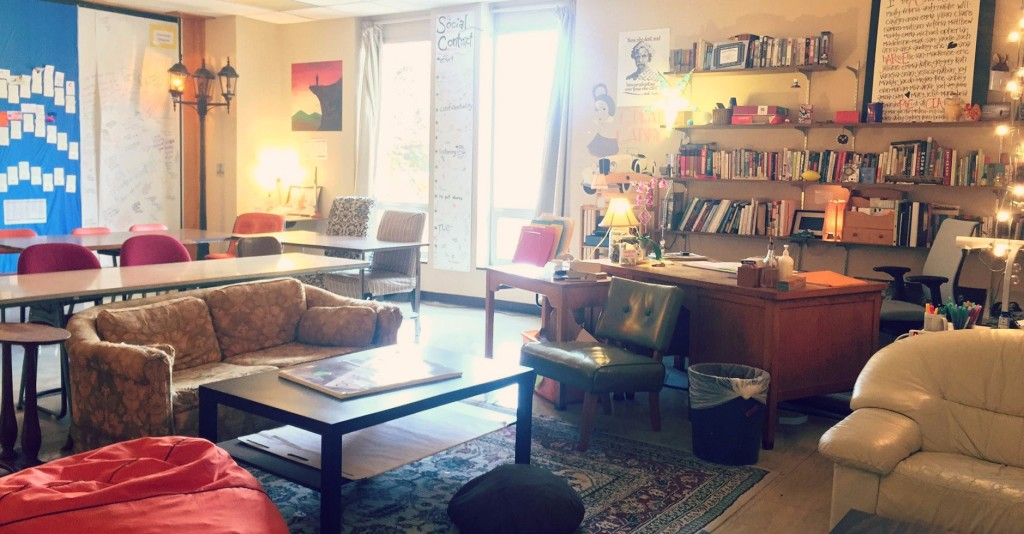
The personal touches in this English classroom make us feel we would like to be a learner in this space. The teacher also shares some excellent tips on how she rotates students through the “best” areas over time. Classroom Eye Candy will be a great inspiration for your flexible learning space.

Tuesday, 16 June 2015

Designing Effective Presentations

Every educator today needs to learn how to present effectively. But how much do they know about what makes an effective presentation?

Garr Reynolds, author of the popular book Presentation Zen Design, notes:
"For many of us, there is a hole in our education when it comes to visual communication... In the past, the tools for creating high-quality graphics and multimedia presentations belonged only to a select few. Today, those tools are in the hands of virtually anyone with a computer. However, possessing the hardware and software tools and knowing how to operate them does not a designer make." (p. 22, Presentation Zen Design)
My colleague Dave and I are very passionate about Visual Literacy. We want to give educators the tools to develop their Visual Literacy skills, and presented recently to our fabulous Primary Leadership Team on Designing Effective Presentations.

Embedding the presentation here would not make sense. If you could understand the content of our presentation just by looking at the slides, then we would have failed in our job. There would be no point presenting if you could just read our slides! However, we did create some other resources which might be useful to share.

Handout

We wanted our audience engaged in our presentation. We didn't want them to feel they had to take copious notes as we spoke. We prepared this handout, because there were a few key things we wanted them to take away from the presentation, and we thought this 1-page handout could be posted at a desk to refer to when designing presentations later.


Finding Quality Images

Finding the right images to support the message you are sharing takes time - and is time well spent. This slide-doc takes you through how to find quality images. It is geared for teachers at our school, so bear that in mind as you look through.


Focus on the Audience

Really understanding what your audience needs and is hoping to gain from your presentation is important. We had participants in our workshop consider the needs of their audience using this handout we adapted from Nancy Duarte's fantastic resource Resonate.


Additional Resources

Some of our favourite resources for presentation design can be found here:


We hope you found these useful! Please let us know if you would like further information about designing effective presentations. 

Thursday, 22 May 2014

Grade 5 Exhibition - Printed Display Boards

This year at East we are lucky to have access to a large format printer. I say large, and I mean HUGE! It is about the size of a piano (see the door in the picture as a frame of reference!).

The Grade 5 students were given the option of printing their display boards in one piece using the large format printer, or they could assemble their boards by printing individual sections, as usual.

The majority of the groups chose to print using the large format printer, which was quite a leap of faith. Time was tight, and deadlines were shorter for those wanting to use the printer (we had to factor in time to print, after all).

I presented to students about: 

  • The elements of design (CARP - Contrast, Alignment, Repetition & Proximity)
  • How to pull people in by maximising visuals and making numbers pop
  • Choosing a font which is clear and easy to read
  • The importance of a minimalist colour scheme
I showed some boards which had been poorly designed so they would know some pitfalls to avoid. I showed some board makeovers, so they could see the difference CARP can make in a viewer's understanding of a display board.

We created some blank Pages templates for the students to use, which were set the right size for their display boards. From there, the groups decided on colour schemes, images, statistics, and most importantly - which information was the most important to share on their board.

Some tips which helped students included:

  • Breaking information into sections, so that related information was in the same section (Proximity)
  • Having a semi-transparent shape behind a text box to make text stand out.
  • Arranging text in columns or chunks, instead of going all the way across the page.
  • Using Creative Commons images, such as the wonderful ones found in The Noun Project.
  • Searching for the largest image size, so no pixelation occurred in the finished poster.

My colleague Dave Caleb and I touched base with as many groups as we could to give suggestions. It was lovely for us to see the different ways the groups chose to display their understanding. The other powerful thing was seeing the students' faces fill with pride when they saw their printed work. 

One student said, "I never thought I would be able to create something THIS professional!"


Some of the advantages to using printed display boards include:
  • An understanding of proportion and scale of the finished product. A big blank space on the page equals a big blank space on the poster. 
  • The ability to experiment and make changes easily. Want to know which font is easier to read? Duplicate the page, and test them out - look at full screen view to see which is clearer (see image on right by way of example - 17 pages of changes!).
  • The range of colours available to use was wider than the colours of backing paper we had available in our store room.
  • Access to tools like the colour dropper in Pages, which meant we could customize colours to images used on the boards.
  • Tools such as the edges and midpoint alignment rulers, which enabled students to align objects easily.


We were very proud of the students' efforts, and hope that even more will take up the opportunity to choose a printed board next year.

Thursday, 27 September 2012

A Question of Colour

The Grade 5 team was lucky enough to have Noah Katz (Digital Literacy Coach at Dover) speak to them about Visual Literacy last week. He spoke about the elements of Graphic Design, referring to the acronym:

CRAB
Contrast
Repetition
Alignment
Balance

Before

Students had the opportunity to design a poster, then give it a makeover. We saw some really interesting before and after shots, let me tell you!

One thing that it seems many of our students struggle with, is an awareness of appropriate colour schemes, or which colours work well together. This is evidenced by the garish rainbow-coloured gradient fill text boxes we see so frequently when students present work digitally.

There are some great websites out there that help even the most chromatically-challenged of us select colours which work well together.

The first I'd like to highlight is Color Scheme Designer.

Color Scheme Designer
Color Scheme Designer provides a broad range of colour schemes to choose from, from monochromatic to accented analogic, and everything in between. It creates a nice palette, which you can see with hex codes as well as just the regular view. This is very helpful when choosing colour schemes for a website.

It also provides a preview of what a website might look like using that colour scheme, providing both light page and dark page examples.

I have had success using these colour schemes to create a custom palettes in Pages when creating a poster. I'm sure there's probably a quicker work-around, but I take a screenshot of the palette, bring it into pages, use the colour picker tool to select the right colours, then drag them into the frequently used colours at the bottom of the colour tool inspector.

Colour Lovers
Colour Lovers provides both colour schemes and palettes with hex codes, together with patterns, which can be customised to a certain colour palette. All very engaging and fun!

Sharing sites like these with our students will hopefully help them gain an understanding of aesthetically pleasing colours, patterns and designs, that will assist them in getting their message across to an audience when they are making posters, designing websites or any visual graphic.

In Grade 5, I hope to help them learn to customize their blog to a colour scheme of their choice using these two sites as a reference.

What other sites do you use for colour schemes? What else can I share with my students?