Showing posts with label design. Show all posts

Monday, 19 June 2017

The Keri-Lee Legacy


As we prepare to say farewell to one of our amazing coaches, Keri-Lee, let's pause to be grateful for what will remain.


1. A stunning sense of design.  

Keri-Lee has become synonymous with CARP.  UWCSEA East has a lot of beautiful design thanks in part to the tremendous work KLB has done here. 

2. A trail of to-be font geeks.

Keri-Lee has left a series trail of bread-crumbs behind for anyone even thinking (don't!) of using comic sans. See here or here.

3. An awareness that technology can uncover empathy.

Use your tech for good.  Here's one of the ways KLB does just that.

4. A call to build better networks.

A school is all about the people.  Keri-Lee has done so much to construct intentional networks.  If you are one of the very few people who haven't seen her exemplify just that, you are in luck, she has a fab resource compilation here.

5. An inspired cohort of student-authors.

Keri-Lee never ceases to see the potential in her students.  Technology isn't about gadgetry, it is about engendering opportunity.  Her remarkable text here will inspire you to do the same.

In honor of KLB's last full day here at school, please share your favorite #Keri-Lee-Legacy with us as a comment below.


Friday, 21 April 2017

Building Better Infographics: Friendly Friday Advice


Interested in building better infographics with your students?

Here's a quick guide to the four essential elements to include in any infographic:

1. The Wireframe:

Structure is key.  Best practice is to map out your infographic before you move to any digital tools.  What structure will work best for the story you want your infographic to tell?

2. Put the info into infographic:

Do your research, be sure to attribute key stats.  Collate your research before heading into the design phase.

3. Call and response

A good infographic is working with a great question.  Starting with the why is another key step for effective infographic curation.

4. Find your flow

Is it easy to navigate through your infographic?

 How do I put those elements into action?

Luckily, our digital tools have come a long way in recent years.  Here is a list of free tools making it very straightforward to embrace those four essentials:

Get inspired

Here are a few of my favorite infographic artists:
Check out his fantastic work here

Check out his fantastic work here


Check out one of his featured infographics in this collection 

To learn more about infographic production, design, and analysis, contact your DLC today.


Monday, 25 January 2016

Digital Bytes - January 25th, 2016


Why the 21st Century Classroom May Remind You of Starbucks
Think about the places you like to work. Think about places that are comfortable and you enjoy spending time. Everyone wants their classroom to be an inviting place where kids enjoy learning. Have a look at this teacher’s experience where she tried to make her classroom more like a Starbucks. A place that is inviting and exciting for kids to come to and learn.
Power of Play
This infographic shows a range of quotes and research findings on the power of play.
Teacher’s Guide on How to Create Google Forms
Google Forms has had a bit of a makeover and an update recently. While this may be great for power users, sometimes it can mean a favourite feature is in a new location, which can be a little confusing. This step-by-step guide will help you create a Google Form from start to finish.

Monday, 16 November 2015

Digital Bytes 16th November


How to Use Instagram in the Classroom
Connecting an idea with a visual is an important 21st Century skill. Instagram is a great platform for the classroom because of its ease of use and ability to be accessed by all. Here are 10 ways of using Instagram in the classroom. Don’t forget to include our hashtag #uwclearn when you post! You might like to follow other educational Instagram accounts like @timlauer or @venspired


10 Fun-Filled Formative Assessment Ideas
Checking for understanding is a crucial part of being a successful educator, and these great tips from the folks at Edutopia will refresh your existing toolkit. Explore these 10 fun-filled formative assessment ideas.


7 Tools for Building Infographics
In the world of information, getting your message across in a way that your audience understands is essential.
Infographics are a fantastic way to share information. Students use a huge number of skills to summarize, categorize, prioritize and collate information into a visual resource.
This article shares seven great tools for building infographics and even includes a short video of the process.

Monday, 7 September 2015

Digital Bytes 7 September 2015

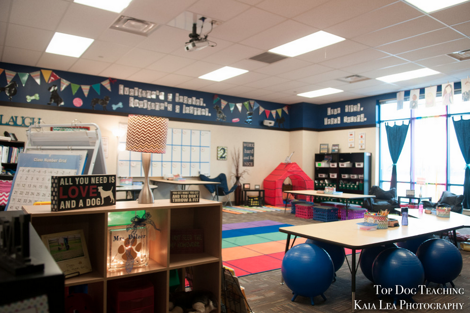
This week's Digital Bytes features a Chrome extension to remove distracting advertisements and related articles from online reading, a great Stop Motion activity for your students, and a blog post about the wonderful classroom designs on display at UWCSEA East.

Thursday, 13 August 2015

Digital Bytes: Back to School

Welcome back to school!

We are kicking off our Digital Bytes with an article about Classroom Design that Promotes Student Thinking, iPad activities to get to know your students, and our in-house resources about Designing Effective Presentations.

Tuesday, 16 June 2015

Designing Effective Presentations

Every educator today needs to learn how to present effectively. But how much do they know about what makes an effective presentation?

Garr Reynolds, author of the popular book Presentation Zen Design, notes:
"For many of us, there is a hole in our education when it comes to visual communication... In the past, the tools for creating high-quality graphics and multimedia presentations belonged only to a select few. Today, those tools are in the hands of virtually anyone with a computer. However, possessing the hardware and software tools and knowing how to operate them does not a designer make." (p. 22, Presentation Zen Design). 
My colleague Dave and I are very passionate about Visual Literacy. We want to give educators the tools to develop their Visual Literacy skills, and presented recently to our fabulous Primary Leadership Team on Designing Effective Presentations.

Embedding the presentation here would not make sense. If you could understand the content of our presentation just by looking at the slides, then we would have failed in our job. There would be no point presenting if you could just read our slides! However, we did create some other resources which might be useful to share.

Handout

We wanted our audience engaged in our presentation. We didn't want them to feel they had to take copious notes as we spoke. We prepared this handout, because there were a few key things we wanted them to take away from the presentation, and we thought this 1-page handout could be posted at a desk to refer to when designing presentations later.


Finding Quality Images

Finding the right images to support the message you are sharing takes time - and is time well spent. This slide-doc takes you through how to find quality images. It is geared for teachers at our school, so bear that in mind as you look through.


Focus on the Audience

Really understanding what your audience needs and is hoping to gain from your presentation is important. We had participants in our workshop consider the needs of their audience using this handout we adapted from Nancy Duarte's fantastic resource Resonate.


Additional Resources

Some of our favourite resources for presentation design can be found here:


We hope you found these useful! Please let us know if you would like further information about designing effective presentations. 

Friday, 5 September 2014

Bling up your Google Forms with Images and Fonts


Google have updated forms with some great custom options for Google Forms. You can read about the update on their blog.

This is really exciting news for those of us who use forms a lot as the standard themes had become a little tired looking. The now you can select from a wide variety of fresh new themes.


But, there's a lot more available than just the new themes. For any theme you select, you can customize the theme by adding your own header image, changing the font, color, size and style for all the different text classes.


Thursday, 28 August 2014

The Noun Project

Thumbs Up designed by Nick Holroyd
from the thenounproject.com
I would like to highlight one of my favourite sites ever:
The Noun Project. It is incredibly useful in the classroom, and is a delight to use.

You can search for anything on The Noun Project and find a graphical representation of it.

Designers upload their creations to the site, and people can download and use these icons as long as they attribute the designer. Attribution is made incredibly easy: all you do is click on the 'how to attribute' button, and it's all ready for you to copy-and-paste.

The really exciting thing for me, is the ability to change the colour of the icons using a simple Chrome Extension called
'The PNG Project'. Provided you know the hex code (I use the websafe colour palette in Pages or Keynote to find mine usually - though a google search of hex codes would lead you to some great sites), you can change the icons to match whichever colour scheme you like.

For details on how to use The Noun Project, please watch the tutorial below.

Tuesday, 27 May 2014

Design for Informational Writing

Recently, I worked with the Grade 4 team to help them present their informational writing.

The students had all chosen a non-fiction topic to write about and done some research. They had then gone through the writing process and created a piece of writing. We wanted to help them to take their writing and display it in a way that was clear and interesting for the reader.

Working with the Grade 4 tech mentor, Haidee Betts, we started with a mentor text about bulldogs that the students had used for this unit. It had one small picture and a chart, but it was far from appealing to the reader.


I then took all the words from the text and put them into an A3 Pages document in separate text boxes. I found some Creative Commons images of bulldogs and used Preview to select the part of the image that I wanted to put into my document.  


Once I had a number of pictures and the text in the document all placed when I wanted them, I decided to try to make a few tweaks to the document. But I didn't want to change my original document, so I made sure that the page thumbnails were visible by clicking on the view button on the top left of my Pages document, and selected Page Thumbnails. I then selected the first page and selected Edit > Duplicate or the keyboard shortcut, Command (⌘) D. 

This is a crucial stage in the process for the students. Now they have the chance to try out some different things with the layout and design of their page and still have the ability to go back easily to their original layout. Most importantly, they can continue to duplicate their pages and this is a great record of their learning. 

To support the teachers and students, I decided to make a number of tutorial videos to help explain some skills that might be used when creating this type of document in Pages. I put these tutorials on the school Vimeo channel and arranged them into a portfolio.


http://vimeopro.com/uwcsea/pages-tutorials

In one of the videos in the portfolio set, I talk through my design thinking in relation to the bulldog article. This is one of the skills that students need to continue to practice and work on in everything they do. We can't have one unit during the year on design and never talk about it again. We must cultivate the skill of design in our students in whatever they are doing. This goes for our teachers too who, whether they realize it or not, are modeling their understanding of design in everything they produce. They are our best resources when it comes to helping students get their message across clearly.


After working with some of the students, it was great to see them work to create some great informational posters.


Thursday, 22 May 2014

Grade 5 Exhibition - Printed Display Boards

This year at East we are lucky to have access to a large format printer. I say large, and I mean HUGE! It is about the size of a piano (see the door in the picture as a frame of reference!).

The Grade 5 students were given the option of printing their display boards in one piece using the large format printer, or they could assemble their boards by printing individual sections, as usual.

The majority of the groups chose to print using the large format printer, which was quite a leap of faith. Time was tight, and deadlines were shorter for those wanting to use the printer (we had to factor in time to print, after all).

I presented to students about: 

  • The elements of design (CARP - Contrast, Alignment, Repetition & Proximity)
  • How to pull people in by maximising visuals and making numbers pop
  • Choosing a font which is clear and easy to read
  • The importance of a minimalist colour scheme
I showed some boards which had been poorly designed so they would know some pitfalls to avoid. I showed some board makeovers, so they could see the difference CARP can make in a viewer's understanding of a display board.

We created some blank Pages templates for the students to use, which were set the right size for their display boards. From there, the groups decided on colour schemes, images, statistics, and most importantly - which information was the most important to share on their board.

Some tips which helped students included:

  • Breaking information into sections, so that related information was in the same section (Proximity)
  • Having a semi-transparent shape behind a text box to make text stand out.
  • Arranging text in columns or chunks, instead of going all the way across the page.
  • Using Creative Commons images, such as the wonderful ones found in The Noun Project.
  • Searching for the largest image size, so no pixelation occurred in the finished poster.

My colleague Dave Caleb and I touched base with as many groups as we could to give suggestions. It was lovely for us to see the different ways the groups chose to display their understanding. The other powerful thing was seeing the students' faces fill with pride when they saw their printed work. 

One student said, "I never thought I would be able to create something THIS professional!"


Some of the advantages to using printed display boards include:
  • An understanding of proportion and scale of the finished product. A big blank space on the page equals a big blank space on the poster. 
  • The ability to experiment and make changes easily. Want to know which font is easier to read? Duplicate the page, and test them out - look at full screen view to see which is clearer (see image on right by way of example - 17 pages of changes!).
  • The range of colours available to use was wider than the colours of backing paper we had available in our store room.
  • Access to tools like the colour dropper in Pages, which meant we could customize colours to images used on the boards.
  • Tools such as the edges and midpoint alignment rulers, which enabled students to align objects easily.


We were very proud of the students' efforts, and hope that even more will take up the opportunity to choose a printed board next year.

Thursday, 27 September 2012

A Question of Colour

The Grade 5 team was lucky enough to have Noah Katz (Digital Literacy Coach at Dover) speak to them about Visual Literacy last week. He spoke about the elements of Graphic Design, referring to the acronym:

CRAB
Contrast
Repetition
Alignment
Balance

Before

Students had the opportunity to design a poster, then give it a makeover. We saw some really interesting before and after shots, let me tell you!

One thing that it seems many of our students struggle with, is an awareness of appropriate colour schemes, or which colours work well together. This is evidenced by the garish rainbow-coloured gradient fill text boxes we see so frequently when students present work digitally.

There are some great websites out there that help even the most chromatically-challenged of us select colours which work well together.

The first I'd like to highlight is Color Scheme Designer.

Color Scheme Designer
Color Scheme Designer provides a broad range of colour schemes to choose from, from monochromatic to accented analogic, and everything in between. It creates a nice palette, which you can see with hex codes as well as just the regular view. This is very helpful when choosing colour schemes for a website.

It also provides a preview of what a website might look like using that colour scheme, providing both light page and dark page examples.

I have had success using these colour schemes to create a custom palettes in Pages when creating a poster. I'm sure there's probably a quicker work-around, but I take a screenshot of the palette, bring it into pages, use the colour picker tool to select the right colours, then drag them into the frequently used colours at the bottom of the colour tool inspector.

Colour Lovers
Colour Lovers provides both colour schemes and palettes with hex codes, together with patterns, which can be customised to a certain colour palette. All very engaging and fun!

Sharing sites like these with our students will hopefully help them gain an understanding of aesthetically pleasing colours, patterns and designs, that will assist them in getting their message across to an audience when they are making posters, designing websites or any visual graphic.

In Grade 5, I hope to help them learn to customize their blog to a colour scheme of their choice using these two sites as a reference.

What other sites do you use for colour schemes? What else can I share with my students?